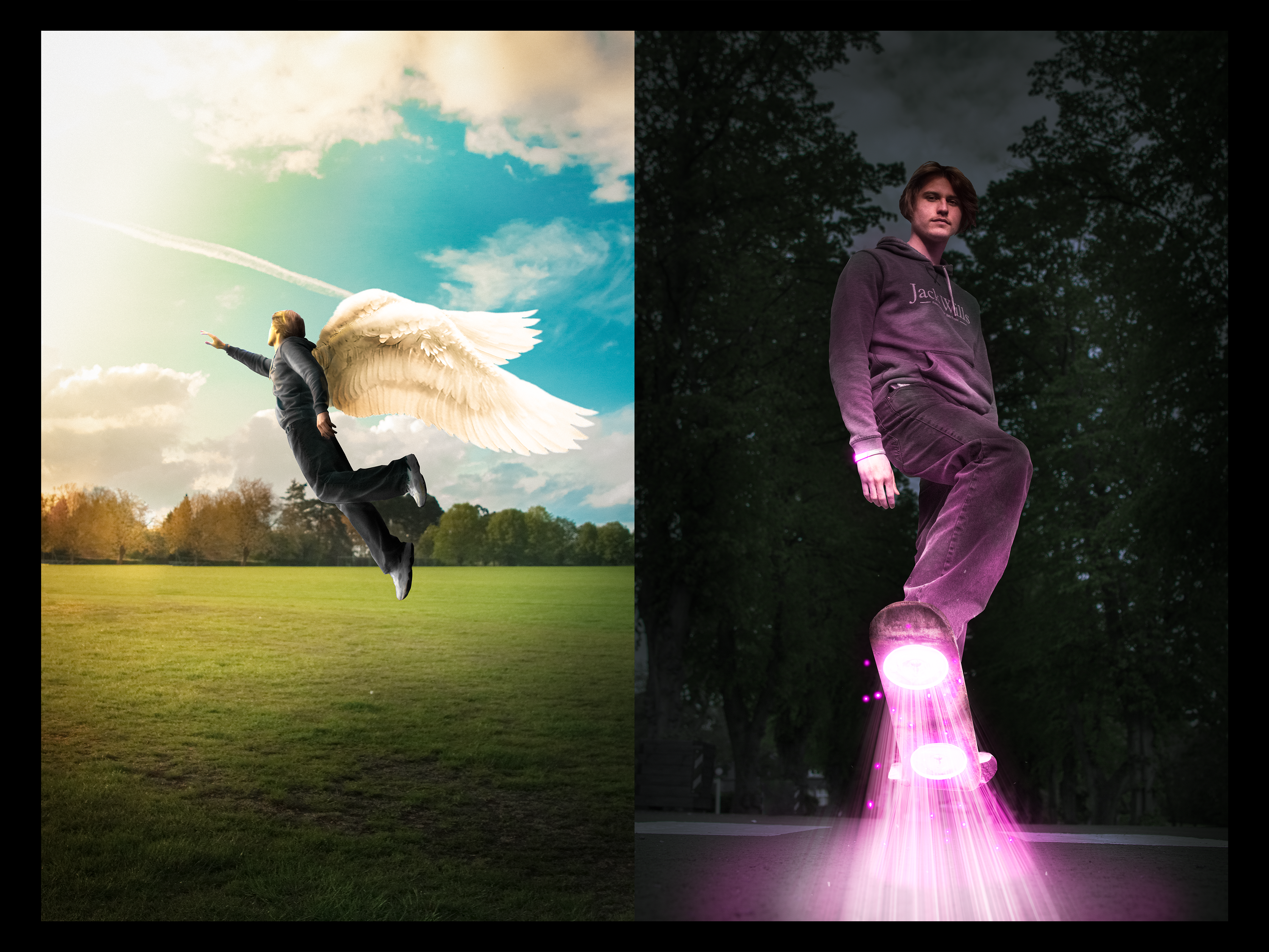
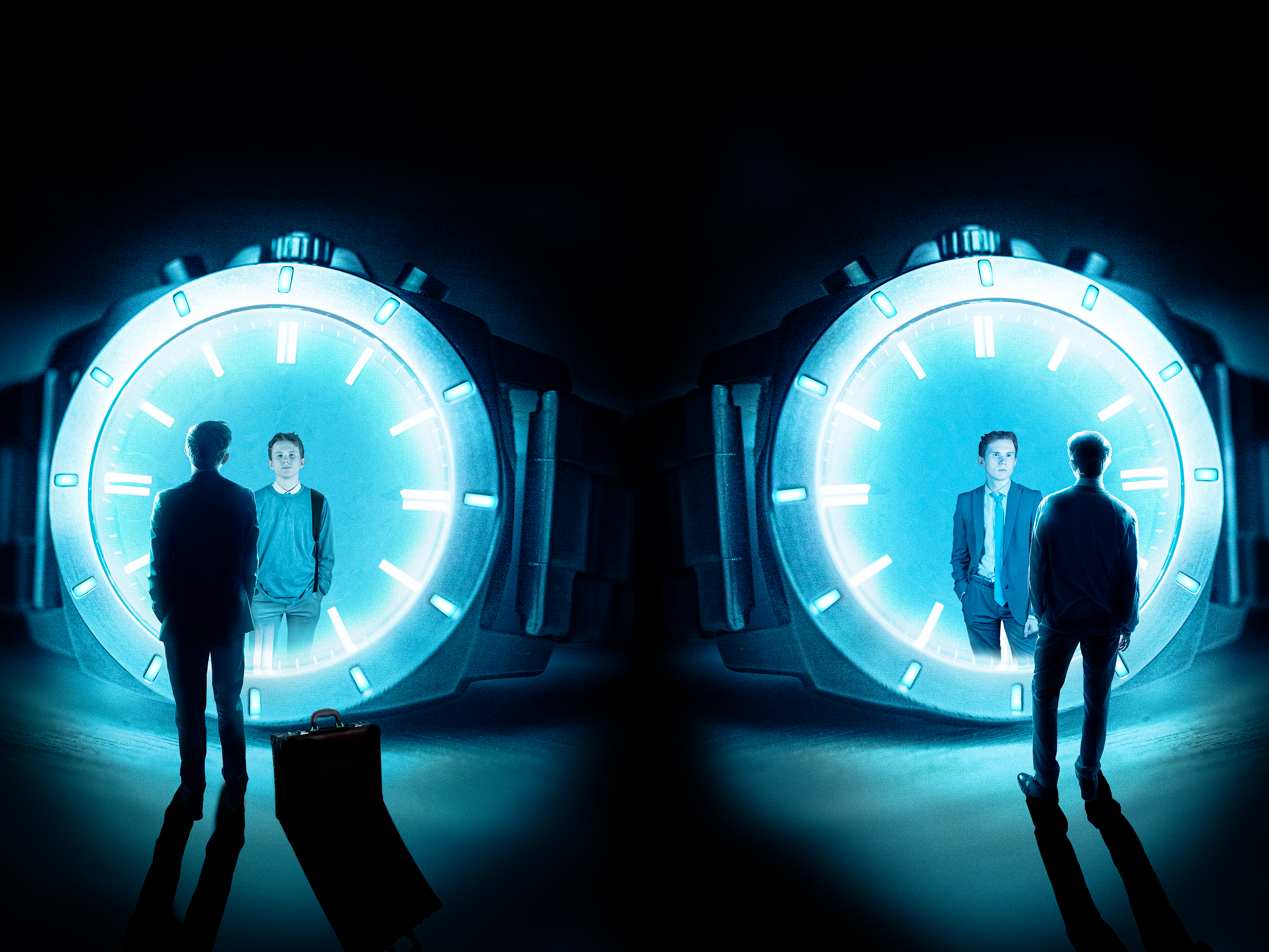
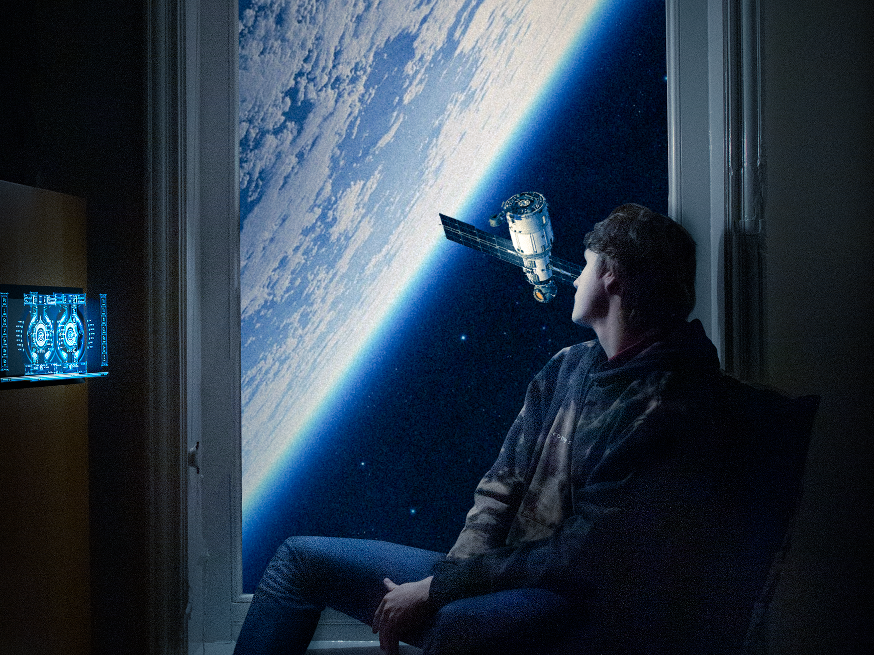
This project is part of Year 1: AME project (Applied Method and Exploration), our year's final project. These symbol was my final result for the 2nd project within that project which is called "static action" Project was split into 2 results. We were told to create a Symbol and An Action Video. The use of randomise coded-generated noun and verbs, we were told to base our final pieces on them.
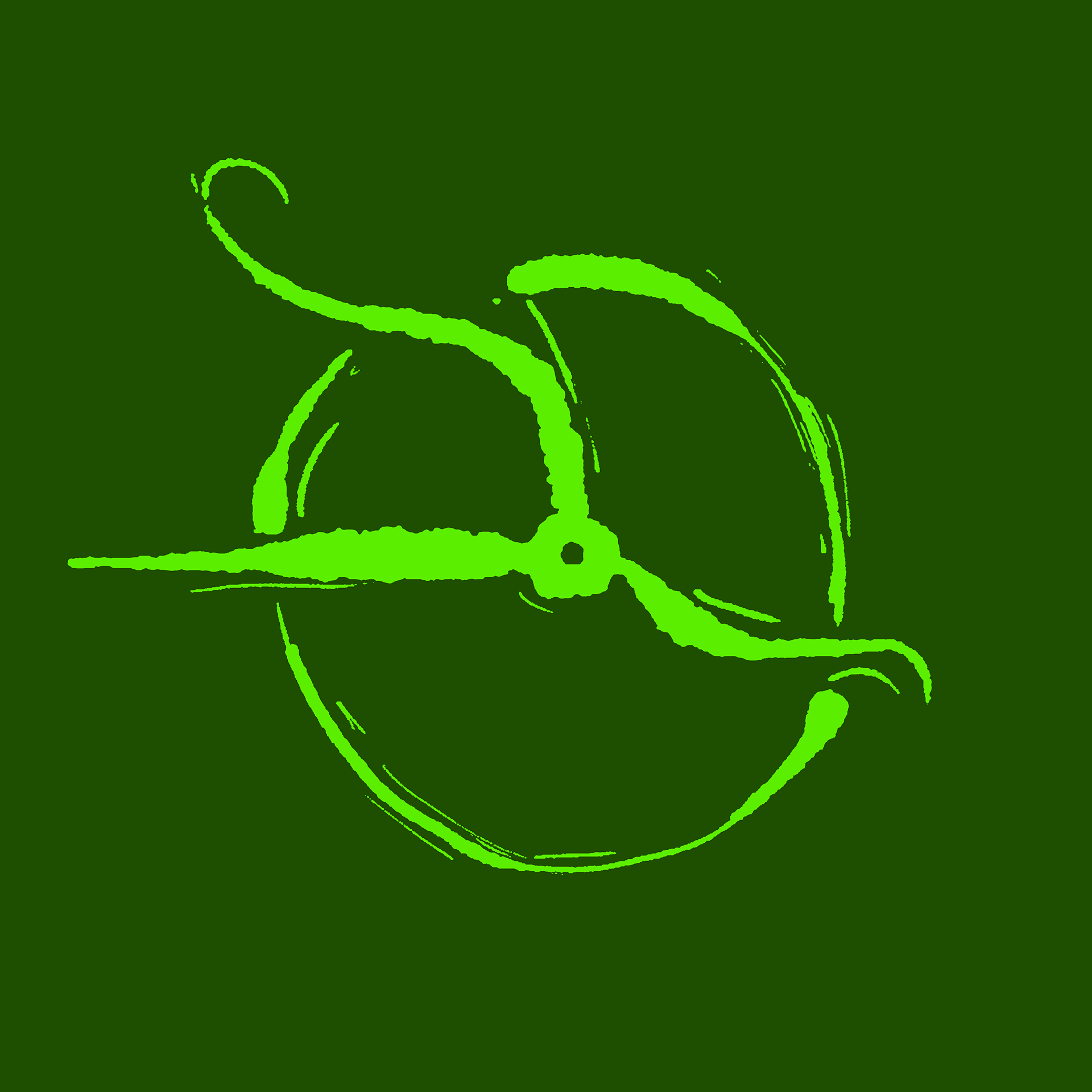
After experimenting with other designs, I chose to settle with this final one was because in this design I made the water drop to look like it’s a cycle and stretching which resemble time continuously flowing just like water, while making the shape of a clock at the same time. The cycles also resembles what we know about time. Which will connect to why I made the inner clock arms like that.
I also chose to make the hand of the clock expand out of the cycle to show the expansion of how time is relative and we don’t actually know how big it could be and for all we know it could still be expanding out.
The Colour choices was inspired from the first session where we stretched/expanded a rubber band to create a shape. I notice within looking back on it that the rubber band colour lighten ups when you stretch it. Using that concept I chose to pick the color that is seen a lot in nature as time is technically nature. I chose to experiment with yellow, red, blue and green. I chose Green as my final color as i feel like it symbolize nature which is like time the most. Another factor i chose green is also because in psychology green is also associate with nature and growth, which i found to be nice as it’s connected to both nature (time) and growth (expand)